At Studio Rivet, I take immense pride in the collaborations I undertake with my clients, and my recent project with Brencorp Properties is a great example of this. Established in 1990, Brencorp Properties – a wholly owned subsidiary of Taverners Group, acts principally as a land development partner, having been involved in creating residential communities in Victoria, Queensland, South Australia and the ACT. Under the new leadership team of Chief Executive Officer Brady Scanlon and Chief Operating Officer Jacqueline Withers, Brencorp Properties sought to modernise and evolve their brand, reflecting their growth and the unique nature of their work.
Objectives
The primary goal for Brencorp Properties was to rejuvenate their founding logo and create a striking visual identity. The aim was to create a brand that communicates their deep expertise and unique offerings while maintaining a professional and minimalist aesthetic. They wanted a brand that would instill trust and consistency, ultimately driving business growth. The brief called for a visual style that is clean, classic, and appealing to professionals, with a specific emphasis on the use of green to symbolise land and growth.
Brand Strategy
My strategic branding process for Brencorp Properties unearthed several key insights that formed the foundation of their new brand and messaging.
Brand Positioning
Brencorp Properties focuses on crafting unique residential communities by collaborating with experienced developers to create environments that foster connection, harmony and exceptional living experiences. With a commitment to excellence in capital partnering and development, their success is closely tied to the success of their partners. Boasting a large understanding of the residential land development market, Brencorp is more than just a capital partner. Working closely with their partners through all cycles of the property market, Brencorp has the ability to position their developments ahead of the competition by not being reliant on banks to fund throughout each project. By aligning their vision with that of their partners, they create mutually beneficial outcomes.
Brand Values
• Integrity: ethical, honest and trustworthy
• Patience: understanding and deliberate in choices
• Insightful: deep industry insights
• Expertise: experience and knowledge
• Loyal: supportive and allegiant to partners
• Passionate: strong feelings and conviction
• Commercial: engaged and intentional
Brand Voice
• Engaging
• Adaptable and flexible
• Professional and formal
• Approachable
Brand Promise
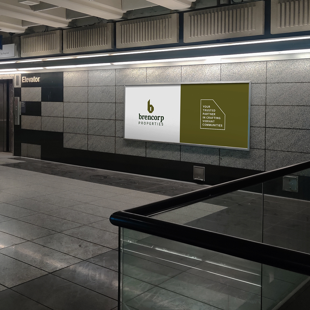
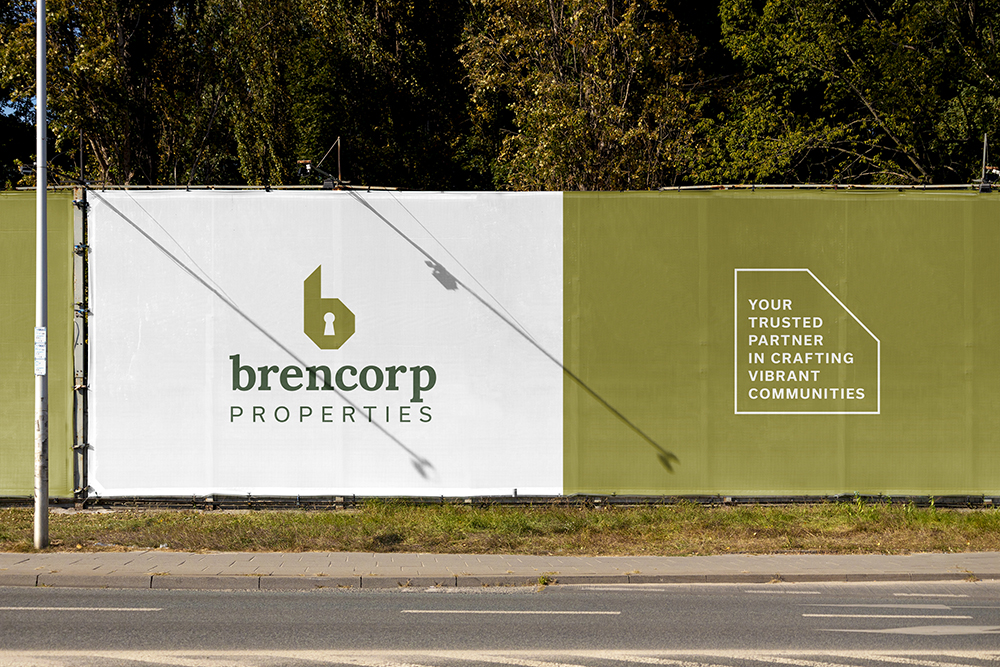
Your trusted partner in crafting vibrant communities
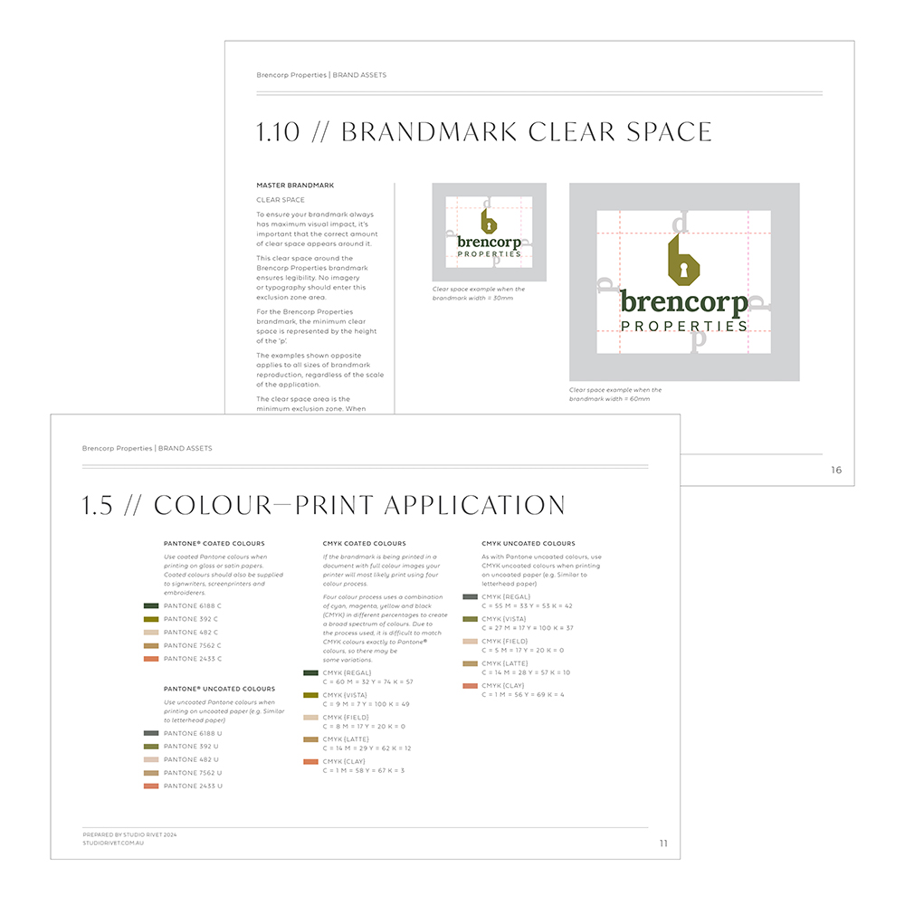
Colour Palette
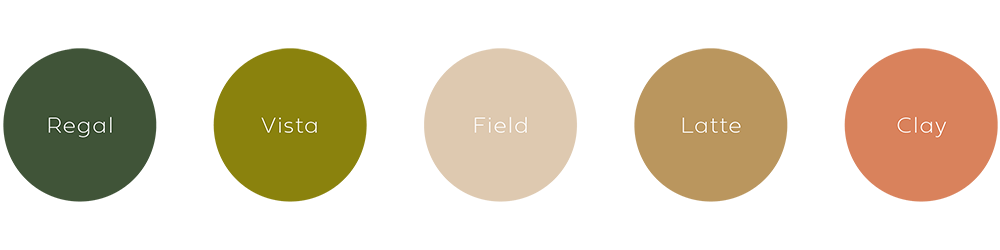
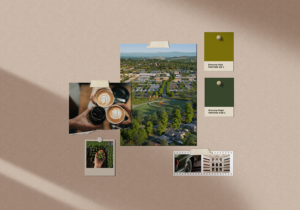
The colour palette for Brencorp Properties is inspired by land and earth, growth and prosperity, heritage and expertise, and regality and sophistication. Green symbolises growth, renewal and harmony, while beige represents warmth, approachability and trust.
Research & Inspiration
I drew inspiration from various sources:
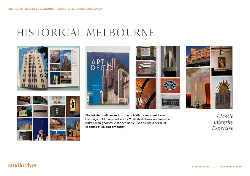
- Historical Melbourne: Art Deco influences highlight classic integrity and expertise.
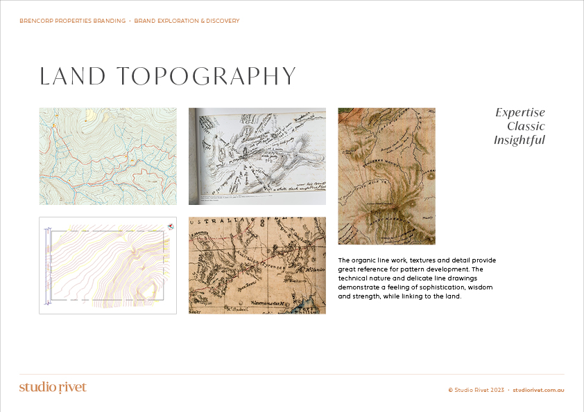
- Land Topography: Organic lines and textures reflect sophistication and wisdom.
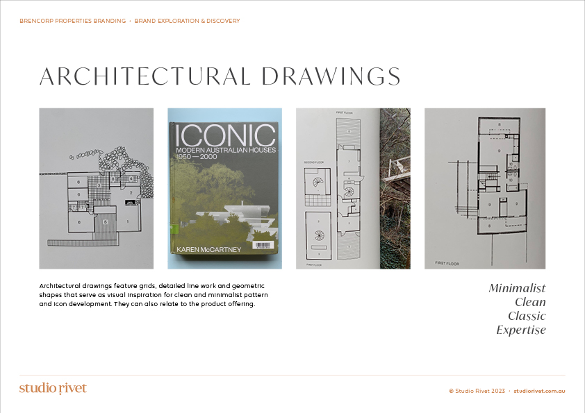
- Architectural Drawings: Clean, minimalist lines mirror the technical precision of Brencorp’s work.
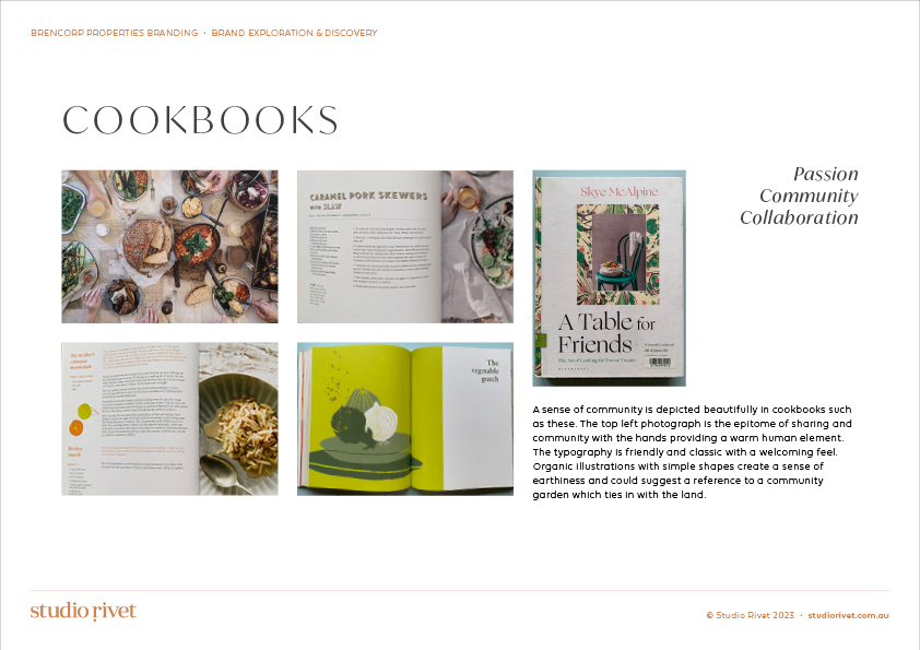
- Cookbooks: The sense of community and warmth aligns with Brencorp’s collaborative ethos.
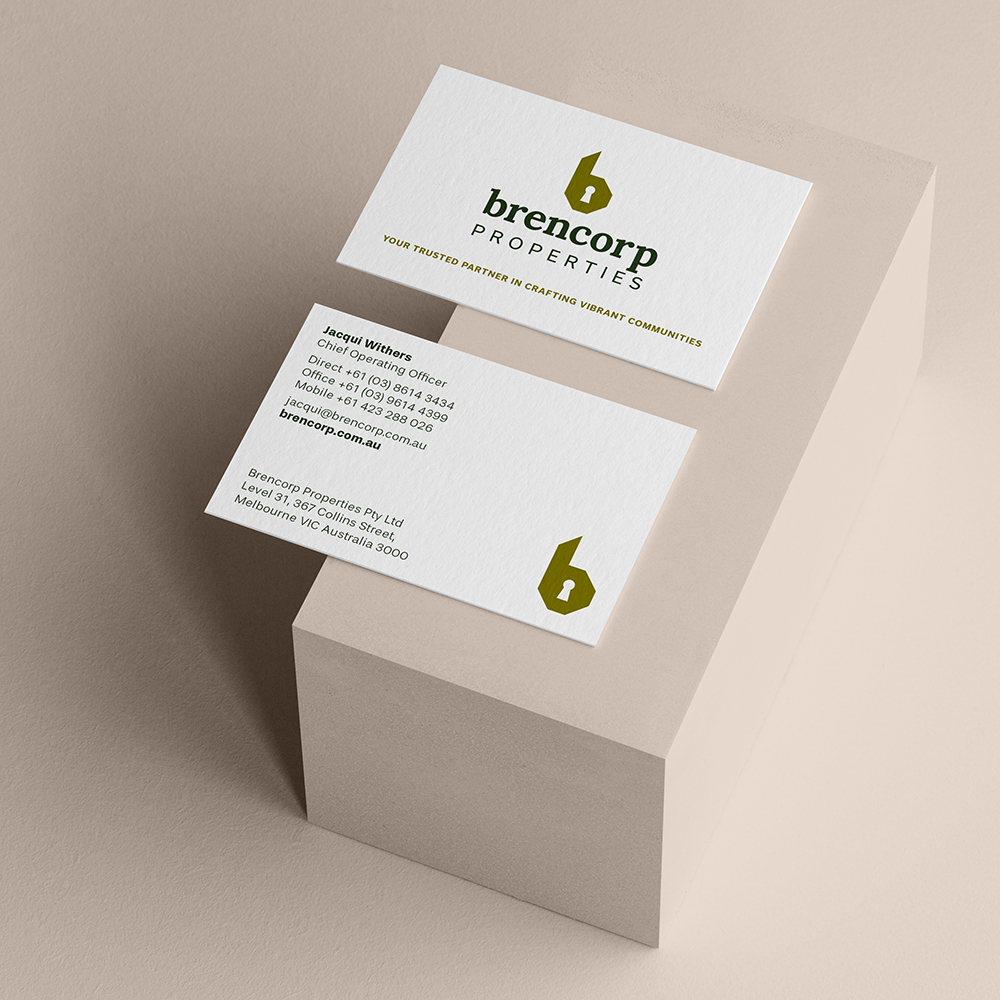
Visual Identity
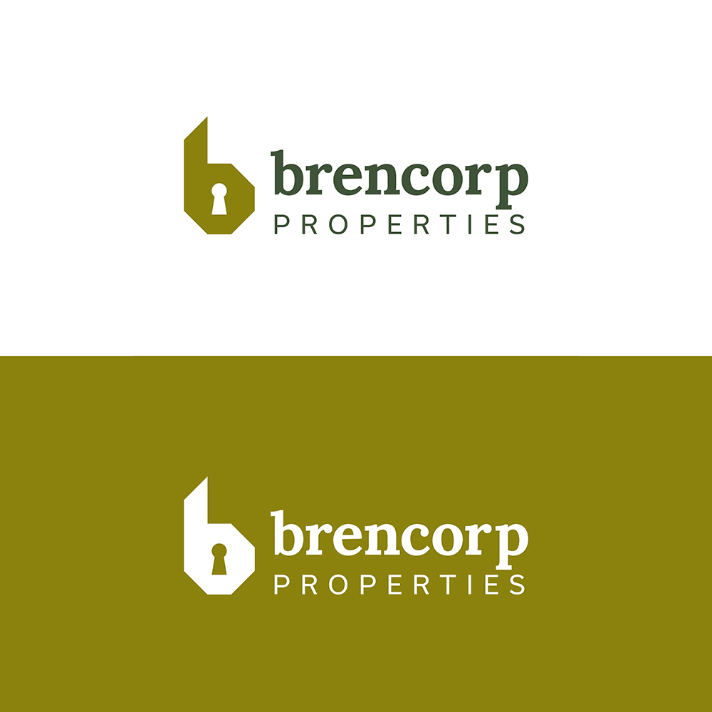
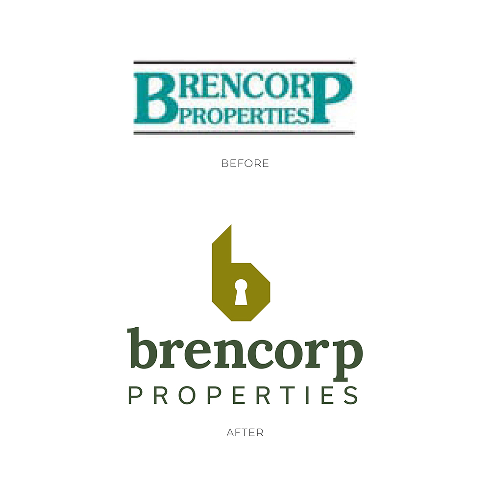
The new logo embodies strength and security, essential qualities for a brand built on trust and reliability. The ‘b’ icon, crafted from a grid, is inspired by architectural drawings and the blocks and angles used in building. The keyhole element conveys security, aligning perfectly with the brand’s vision.
Typography
Choosing the right typefaces was crucial. The selected fonts balance classic luxury, strength, professionalism, heritage, and longevity. They ensure clarity and legibility, creating a sophisticated yet approachable brand identity.
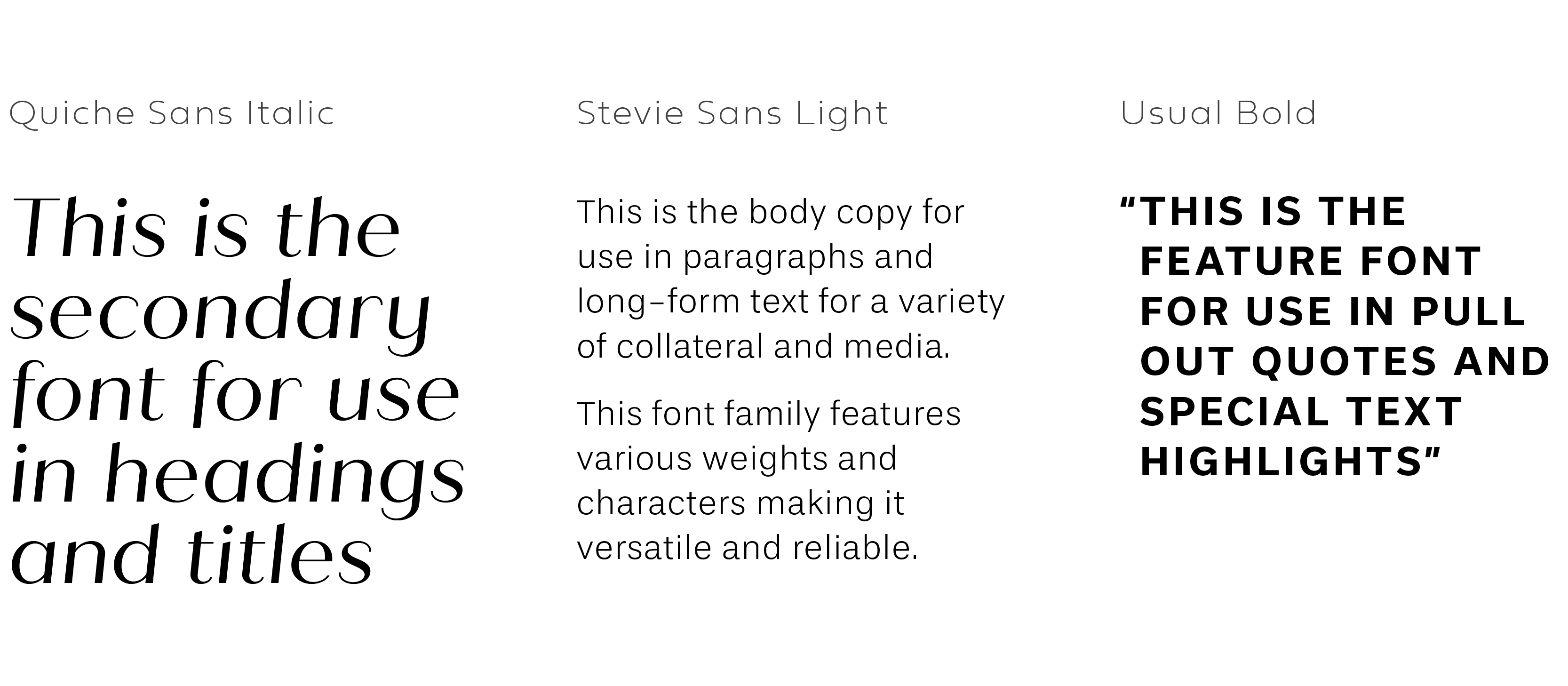
When looking for the ideal font family to complement the Brencorp Properties logotypes, I looked at pairings that sat in harmony, avoiding fonts that were jarring or too contrasting. They too had to be clearly legible both from a distance and close up. The font family needed to be available for both desktop and web application.
Tagline Sub-mark
The tagline highlights Brencorp’s expertise and leadership, visually supported by a strong yet simple box shape derived from the ‘b’ icon, ensuring it complements rather than overpowers the master logo.
Brand Pattern

The pattern, inspired by building plans, emphasises expertise and commercial professionalism through its minimalist and classic design.
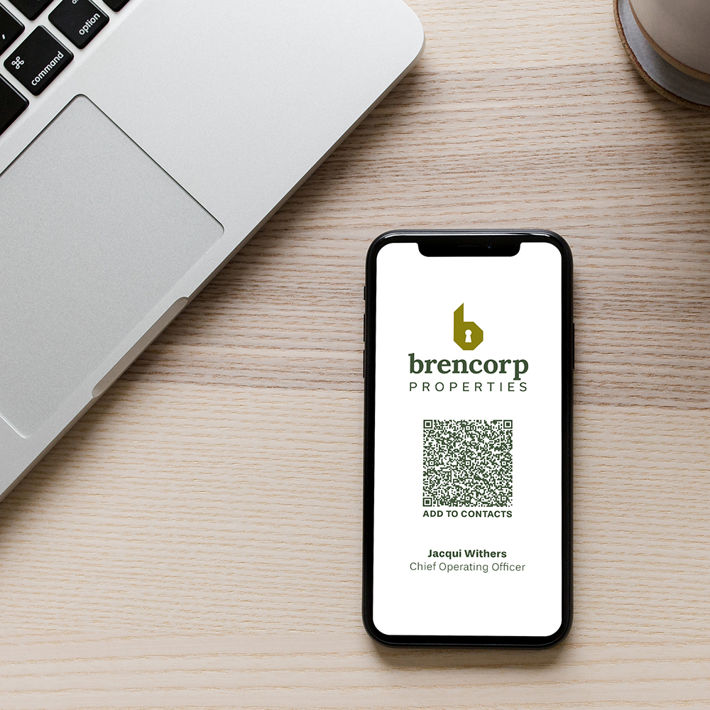
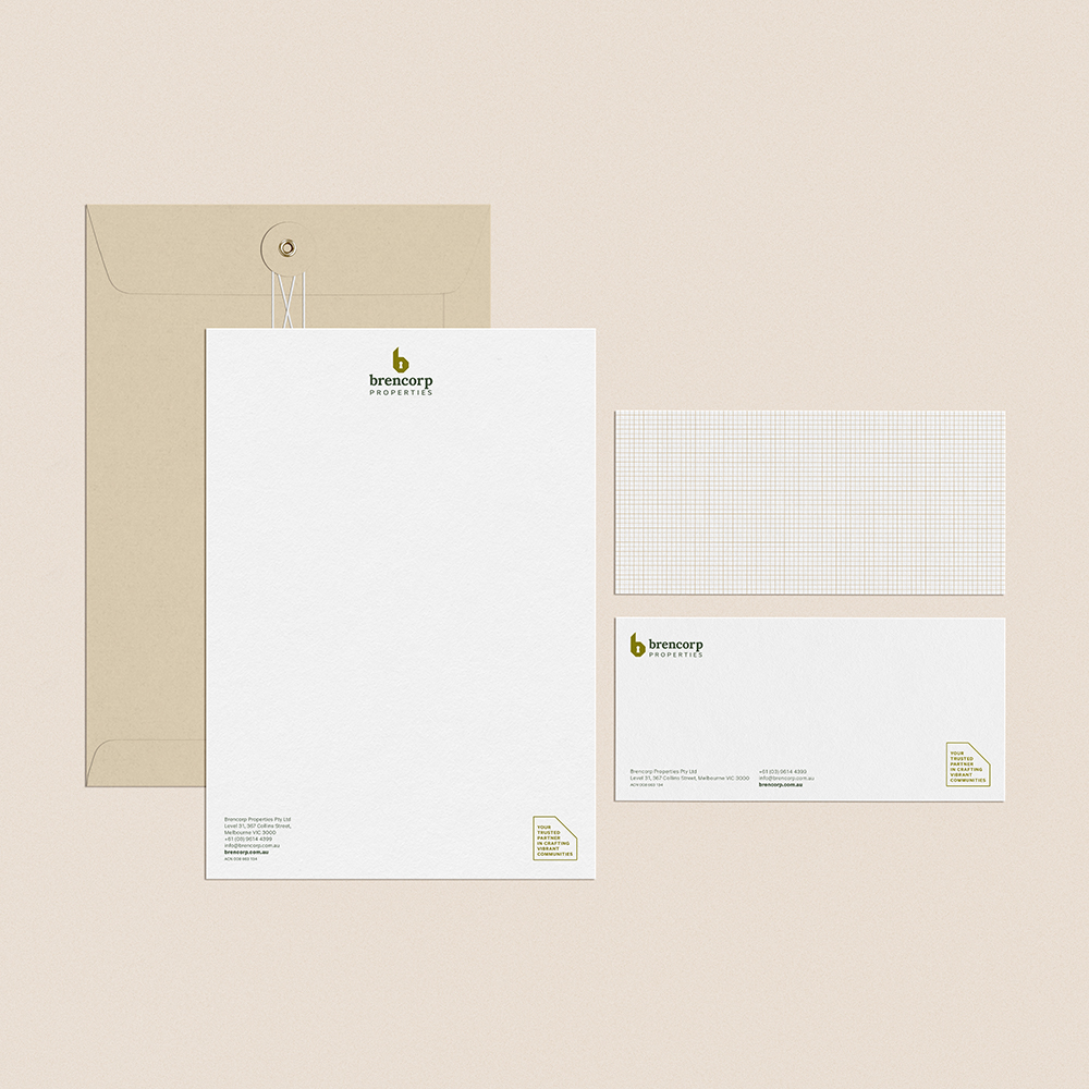
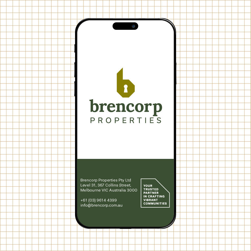
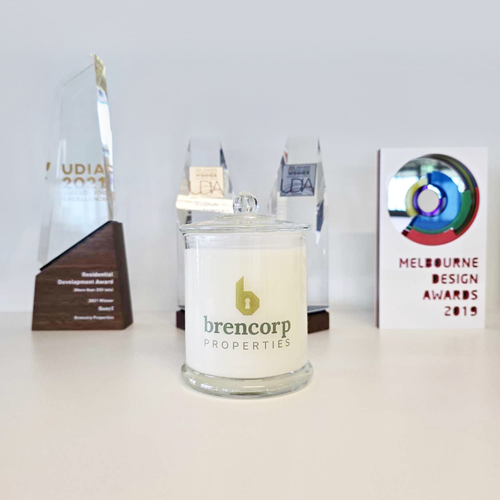
Brand Application
Brand Guidelines
The Result
The refreshed Brencorp Properties brand has successfully achieved a modern and professional presence. This rebrand has not only enhanced team morale and confidence but also garnered positive feedback from industry stakeholders. As Jacqueline Withers, Chief Operating Officer, remarked, “Laura guided us with patience through the design process in a very professional manner. We absolutely love the outcome and are very proud to show off our modern new design to all our stakeholders.”
By aligning our creative vision with Brencorp’s strategic goals, together we have crafted a brand that’s ready to support and grow with their partners, while standing strong among competitors.
To learn more about how we can work together to transform your brand, book a free clarity call.

View comments
+ Leave a comment